The Summary
Users - Why are there two different wizards? Give me one place to launch a tactic with all of the tools I need!
The Business - We need to move off our old frontend library to a new library, and make sure nothing is missed.
Results - 30% quicker tactic creations, increased discoverability of upsell/cross sell features.
The Problem
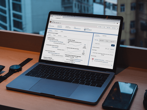
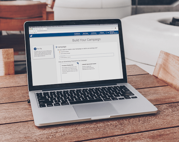
This was my first project during my time at Terminus, and it cut to the core of the product. At the time the app had roughly two main parts: the tactic creation wizard that allows customers to create account-based ads, and reporting functionality for those ads. The Product team wanted to create a new integration between Terminus and LinkedIn, and Engineering was switching our front-end code base from Rails to Angular. My job was to design the new wizard with our brand new design system, and combine several iterations of wizards that had come before.
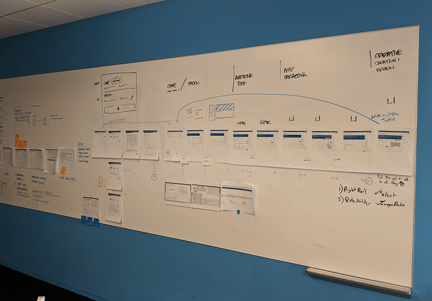
Early whiteboard sketches of the current flow
The Research
Because we had two different wizards in production, it was essential to get input from users of both to make sure that functionality wasn’t lost. Our customers had gotten very good at building workflows outside of our product, and that meant moving or removing features could have further reaching consequences than expected. While I conducted the interviews, I compiled best practices for wizard and form design, as well as a heuristic analysis of our wizards.
One of the key challenges when designing a wizard is balancing the amount of information per page and the number of pages. Too much information per page and users can get overwhelmed; the whole point of a wizard is to break a complex process into smaller steps. But users also hate being confronted by a wizard with 10+ pages, especially if some of the steps relate to each other and they’re constantly moving back and forth to reference information. It’s a tricky balance to maintain, and as I found out, our Rails wizard was an example of the first problem and our Angular wizard was an example of the second problem. My interviews with customers confirmed this. While talking to customers, I frequently would uncover a desire for more contextual help; usually a customer wouldn’t come out and say that, but as we talked it became apparent it was a hidden need. New users in particular would sometimes fill out a step without fully understanding the implications of their actions, causing problems down the line.
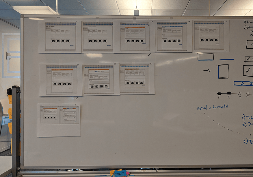
Design variations to test with customers
The Design
While I was completing the research, I started to sketch ideas for how to improve the experience while still maintaining the look and feel of the previous wizards, so our current customers wouldn't need to relearn how to use our product. I moved from the whiteboard to Balsamiq to Sketch, getting feedback at each stage from customers, product, and engineering. As engineering dug in, we collaboratively identified additional technical and UX challenges that needed to be addressed. I also worked closely with UX engineering to identify the components we would need (such as the fancy visual radio buttons above) so they were ready in our design system by the time engineering was ready to implement them. By working closely together, we were able to identify and resolve issues quickly as they arose.
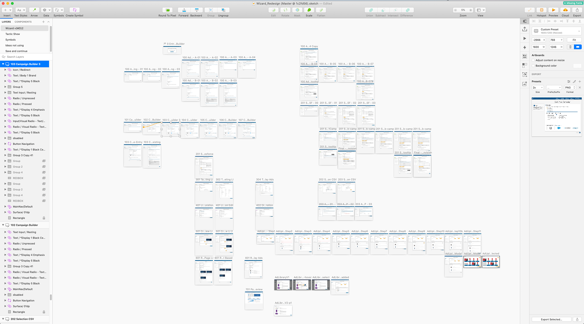
Warning! Wizard can branch.. a lot!
The Reflections
As a core aspect of the product, improvements to the wizard are never truly complete. While the launch went well, we also found areas rougher than we expected. We had to make some tough choices as our deadline loomed, and our customers were clear that some of the things on the cutting room floor were essential to their workflow. Wizards and forms are extremely difficult to get right in one shot, and continuous improvement and discovery is the only way to build the best product for your customers.
Thanks for the shoutout Eric!